
A few weeks back I wrote a post saying that the chances of losing money in the stock market over the long run are really low, at least based on a historical perspective since 1871. Yesterday I revised the analysis to look at the era since 1930, and I found that stocks performed even better.
However Andrew H, a reader from Chicago, commented that my analysis only scratched the surface. I just looked at whether an investor made or lost money, not how much they made or lost. Also, I didn’t take inflation into account (you know my reasons). They are very valid criticisms, so I am taking up Andrew H’s gauntlet.
As an aside, Andrew H and I went to junior high together. He was the smartest (or possibly the second smartest while I on the other hand was maybe the 40th smartest) student in our school, and I admit that I always looked up to him. This one’s for you Andrew H.
Refresher from last time
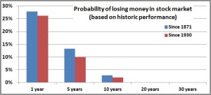
We’ve already seen that if you look at returns since 1930 (I’ll explain why I’m starting with 1930 instead of 1871 in a second), the chances of you losing money in the stock market after a year is about 26%. Of course we know time is on your side, so if you look at a five-year period, the chances of you losing money go down to 10%. At 10 years it’s 2%, and at 20 years and 30 years it’s 0%–there is not a single 20 or 30 year time period since 1930 where dollar cost averaging in the US stock market would have resulted in a loss. Let that sink in for a second.
But Andrew H raised some very valid points, so let’s see what the data says.
Return distribution
Going back to 1930, we already said that you don’t have a single instance where if you invested the same amount of money every month, that you would have lost money over a 20-year time period. If you assumed that you invested $10 every month, over 20 years your total investment would have been $2400.
Of all the 20-year time periods since 1930 (there are 768 of them if you’re curious), the worst you would have ever done was starting in March 1989 (ending at the depths of the 2008 financial crisis) and you would have ended up with $3388. So your $2400 investment increased over 40%. Of course if you annualize it, that is only 3.3% per year. But that’s still pretty good isn’t it? The best it ever got was starting in April 1979 (ending as the tech bubble was peaking in 1999) where your $2400 would have become $20,236 (over 18% annualized).
You can do the same thing for the 30-year-time periods (648 of those) and you get similar results. You would have invested $3600. Your worst outcome would have been starting in October 1952 (ending as inflation peaked and the US was in the recession of the early 1980s) where you would have ended up with $12,827. Just like before, that doesn’t really seem all that bad. Over 30 years your money quadrupled and that was the WORST it ever got (7.5% annualized). The best was starting in February 1970 (again, ending with the 1999 tech bubble) where $3600 would have become $62,868 (16% annualized).
If you graph out the distributions you get this:
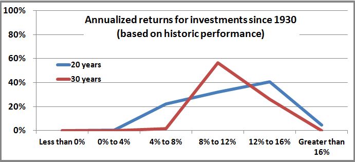
For both time horizons, you see that most of your returns are in the 8% to 16% range. As we just mentioned, you have some down years where the returns get a bit low, but even then they stay well above 0%.
Including inflation:
You can run a similar analysis but include inflation. Even I would agree that inflation during some of those time periods were substantial (although of course, not as substantial as the CPI would lead you to believe). The reason I chose to do this analysis starting in 1930 instead of 1871 is because of inflation. The CPI started 1913. You can estimate data before that but I really don’t trust that data. I think inflation is a questionable enough factor as it is, so there you go. Either way, I don’t think it changes the conclusions we’ll come to.
So when you invested each month $3600 starting in 1952, how much would your $12,827 buy you in 1982. Remember that the 1970s and early 1980s had tremendous inflation (peaking at well over 10%), so it is going to have a major impact.
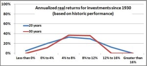
As we expected, those distribution curves shifted to the left (the real returns got worse when we accounted for inflation). Looking at the 20-year time horizon, you had negative real returns* about 5% of the time. So there you go. That’s a bit of a bummer but that’s reality. There were some periods that started in the 1950s and early 1960s (so they ended in the late 1970s and early 1980s) when inflation would have eaten away your returns and taken you into the red.
However, Father Time comes riding in on his white horse and saves the day. While there were a few negative periods if you just used 20 years, if you push your time horizon up to 30 years there are no negative returns. In fact, the worst time period was October 1952 (same as when we didn’t include inflation). Remember that if you didn’t account for inflation your return over those 30 years was 7.5%, but now if you account for inflation it drops to 1.3% per year. That’s a big drip and it definitely sucks, but remember, that’s the WORST. As bad as it gets, the stock market has historically delivered a positive return even after you strip out inflation.
I want to thank Andrew H for keeping me honest. This little exercise has just further reinforced my faith that investing over the long term will make you money (ha, you thought I was going to forget—historic performance does not guarantee anything in the future). No one knows what the future holds, but if history is any guide, putting your money in the stock market over your investing career is a pretty solid move.
*When I say “real returns” that means returns that have been adjusted for inflation.
One thought to “Era after 1930—inflation adjusted”